BODONI
The style
The Bodoni style is one of the most known styles between the XVIII and XIX centuries. The XVIII century is characterised by the presence of the philosophical ideas of the Enlightenment and from the Neoclassic artistic movement. Bodoni, influenced by both the innovations and ideas of his historical period, created his style on the basis of some of the most important Enlightenment concepts, including the search for an originary pureness and the belief in the human reason. This influence is clear, for instance, in the fact that his style is simple and rigorous, just like reason requires clearness and rigour. Like Bodoni writes in his Manuale tipografico, book shall be read by as many people and as many times as possible in order to let good books and good contents to be of use and pleasant. For example in his books there are only a few images, symbols or ornaments, since the reader focus has to be on the text, the core of a book.
At the same time the ideas of Neoclassicism are visible in the style and in the shape of Bodoni's works. Indeed some specifc aspects are characterised by the influence of the classic art. There is great attention for the beauty and the architecture of the single elements and of the contents in general. For instance the characters are decorated with refined serifs enlight, which, together with proportionated spaces, enance the beauty and the readability of words. The beauty of the book is emphazised by its regular proportions, a clear reference to the classic world. Therefore we can state that the search for a classical beauty is never oppressed by the rigour but at the same time beauty never prevents a good readability. It is instead at its service. Bodoni himself in his 'Manuale tipografico' says: 'l'idea del Bello non dee certamente confondersi con quella del Buono e dell'Utile; ma elle sono però come tre diversi aspetti di una cosa sola [...]'.
Font and measures
General assumptions
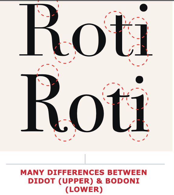
Bodoni characters present “thin, horizontal serifs, vertical axes, high contrast between thick and thin strokes and round terminations on certain lowercase letters.“ The presence of serif forces, in order to have a good readability, to set the letters large enough to ensure that the hairlines maintain their integrity. Letter spacing must be proportionate to the font size: the higher the size, the bigger the space in order to allow the best readability, in particular for large titles. Text character spacing should also be kept open and even. Normal or even a little extra line spacing will also help to offset the strong vertical emphasis of Bodoni.
The text usually fits one column which can sometimes be surrounded by straight lines. Moreover column width must be kept moderate since very long lines of Bodoni tend to tire the eye and make reading difficult. Indeed it respects the gold section proportions which have been generically acquired by the print in order to allow a good readability.
Font
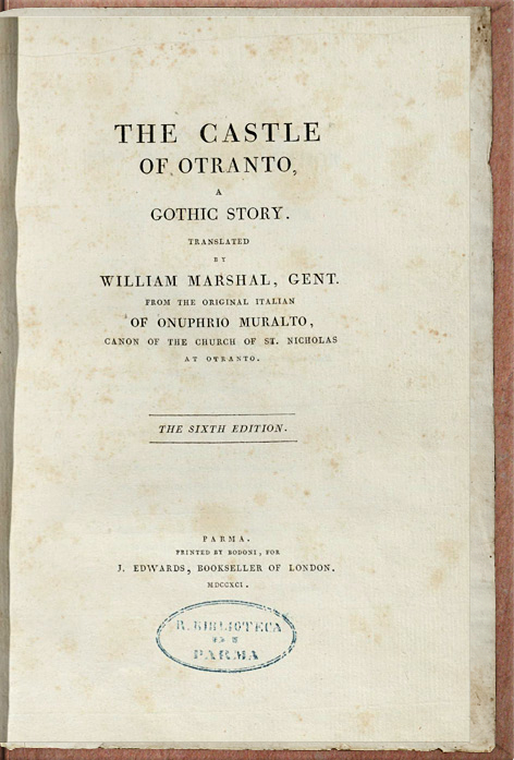
The fonts used in this magazine are 'Bodony 6 ITC' and 'Bodoni 72 ITC'. These are not original Bodoni's. During the following centuries there have been a lot of remaking of the Bodoni font, each of them based on a different font (with regard to the Bodoni's 'Manuale tipografico'). Each of them was produced for a peculiar need and by a specific team with different purposes and with a different distancing from the original font. The Bodoni ITC fonts were produced in the 90s and 'applied differences in design and proportions to the typeface in digital'. They were produced by two different teams: 'ITC Bodoni Six, curated [...] by Goldsmith, was based on Filosofia Bassano by Bodoni'. It was designed 'after a comparative analysis of examples found in the Manuale tipografico' for small bodies. ITC Bodoni Seventytwo, curated by Fishman, was modelled on Papale, the larger dimension Bodonian typeface. Indeed it was designed for large body text.
Layout
Both in the cover page and in the articles the text is represented in one single column. The margins follow the measures of the gold ratio (see below), typical of the printing books in particular in the XVIII century one.
The background for the cover is given by the overlap of an old fashioned paper on a special coloured paper derived from a Bodoni's book. The articles background is instead simply based on the same old fashioned paper. Both the cover page and the heading of the articles are presented as the introductive page of a Bodoni's book, in the second case in the sequence: title, subtitle, author, image and date. The font use for the most of them is 'Bodoni 72'. Between the heading and the text there is an empty part which reproduces the space usually present between the chapter title and the chapter text. In this way each article can be considered as an independent chapter of the same book.
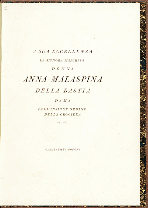
The proportions among the components of the body of the articles are based on the body of some Bodoni's prose books. There are only some exception to this general rule: publication notes, which are in the style of Bodoni's versified dedication to marquise Anna Malaspina, and the images descriptions, which are in the same style and size of the publication date. In both these last cases the choices are arbitrary since I could find no similar example. The text alignment is justified like in all the prose books, with the only exceptions of the blockquote, which is left aligned, and the figure caption, which is italic and center aligned. Moreover they both have a lower font size. The first letter of each opening paragraph is treated like the first letter of a chapter and has the same size as the title one. In all the other cases, the first letter of each paragraph is indented and of the same size as the rest of the body.
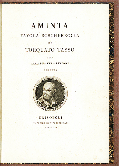
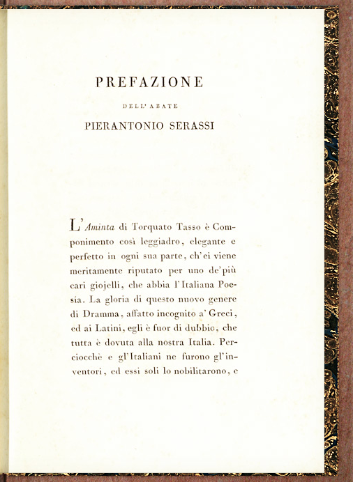
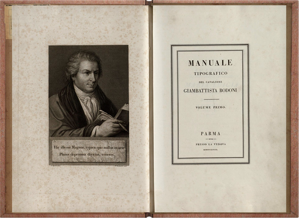
The images have been modified so that the colour recals the mixture of black and white and sepia of the Bodoni's images. The pictures are reproduced in two different ways. The first one, usually located in the heading, is sized like the portrait of Torquato Tasso in the 'preface' of Bodoni's 'Aminta',. The others are reproduced with the proportions of the picture of Bodoni in the first pages of his posthumously published 'Manuale tipografico'.
Measures
As a general statement the measures of the Bodoni style are regular and rigorous. The actual measures change from book to book and from font to font, but the proportions between the parts of the text are fundamental. In order to best represent this style a certain rigour in the reproduction of the proportions between the parts is essential. Some of the Bodoni's books, digitized in Biblioteca Bodoni, have been used as examples to produce this style.
- 'Aminta' was used as basis for:
- Cover and articles main font proportions:
- .author: 2/3 H1
- .byline: 1/3 H1
- .subtitle: 1.1/2 H1
- p: 1/2 H1
- First letter of first 'chapter' paragraph: 1/1 H1
- Margins:
- since in a web page we are dealing with a single page, for the purposes of this web site, the article layout is imagined as the left page of a book (left 2/3 right and top 2/3 bottom).
- 'Castle of Otranto', ‘Aminta’ and ‘Pitture di Antonio Allegri detto il Correggio’ were used as inspiration for the proportions of the character text spaces:
- letter space must be enough to leave a space between the serifs, so without kerning. This space is not always the sam, it increases together with the size of the font. The higher the size, the wider the space.
- word space depends on the size of the font and must be measured with respect to letter space. In fact the wider the font, the wider is required to be the word space so to allow a good readability. Indeed a space which is too much small or too much large would not allow the reader to have a good comprehension of the text since in the first case the letter space would create confusion on were precisely a word ends, but in the second case the text would be too wide, would tire the eye and would loose the concentration of the reader.
- line height must be quite wide. In particular in the cursive style there his the necessity of leaving a quite wide space between the previous line and the following one so that the ascender and descender line never touch.
- text indent: every paragraph has a an indent in its first line. This is proportionate to the column width. The wider the column the larger the indent.
Colors, ornaments and other aestethical features
The colors are pretty simple in the Bodoni style. There are two predominant colors: the light brown of the paper and the black of the ink (in hex #44413c). There are no other colors apart from a sepia like color used for images, which in this case is reproduced with the application of a mixed percentage of grayscale and sepia filters. The color for the hover was selected from a palette of browns, based on the color of the background . The way in which the images are reproduced again refers to the Bodoni's neoclassic basis. The images are centered and simple, with clear and simple boundaries and shapes (the square, the rectangle and the circle). Bodoni looks for the simplicity, proportion and strength of the figurative element. The absence of colors, apart from the black of the ink used for printing, also denote its rigour and pureness. The blockquotes and the publication notes are surrounded on the top and on the bottom sides by a pointed line. This is one of the types od lines proposed by Bodoni in its Manuale tipografico. The aim of the lines is the one of graphically separate the text from the notations in order to give the reader a clear distinction between different contents.
Sources
Luigi Fumanelli, 'Il carattere nella storia e nell'arte della stampa'.
Biblioteca Bodoni. http://bibliotecabodoni.net/it/biblioteca
Museo Bodoniano. https://museobodoniano.com
https://museobodoniano.it/tipi/itc-bodoni/
Riccardo Olocco and Jonathan Pierini, 'Parmigiano'. http://www.riccardolocco.com/img/Parma_booklet_09.2013_hires.pdf
id="biblio"James Clough, 'Bodoni and his roman and italic types'. https://articles.c-a-s-t.com/bodoni-and-his-roman-and-italic-types-a15325d03b06
'L’architettura della pagina'. http://www.unife.it/interfacolta/design/insegnamenti/laboratorio-di-design-della-comunicazione/materiale-didattico/file-pdf/2016-17/04_ldc_2016_larchitettura_pagina_low.pdf
LIBERTY
The style
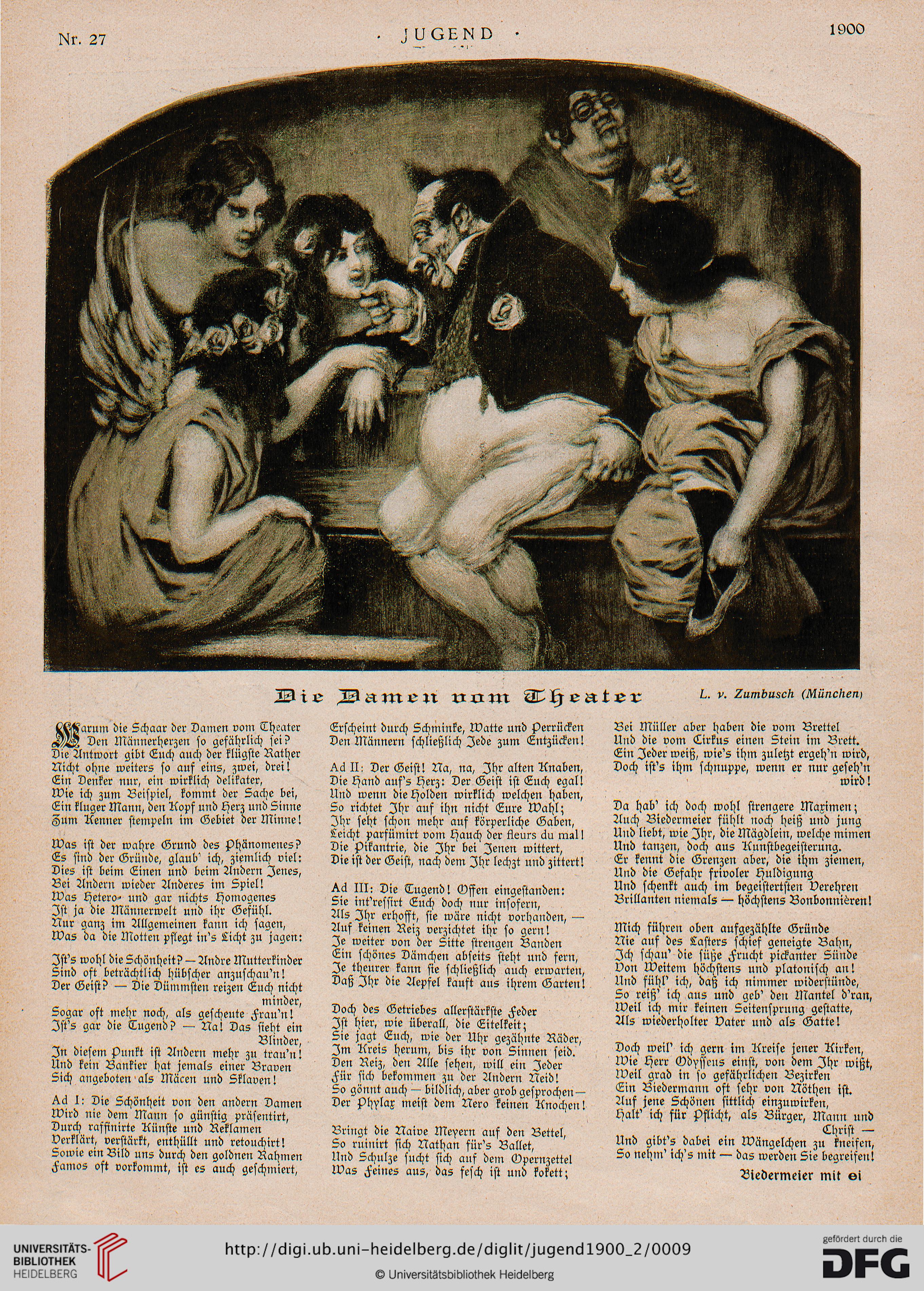
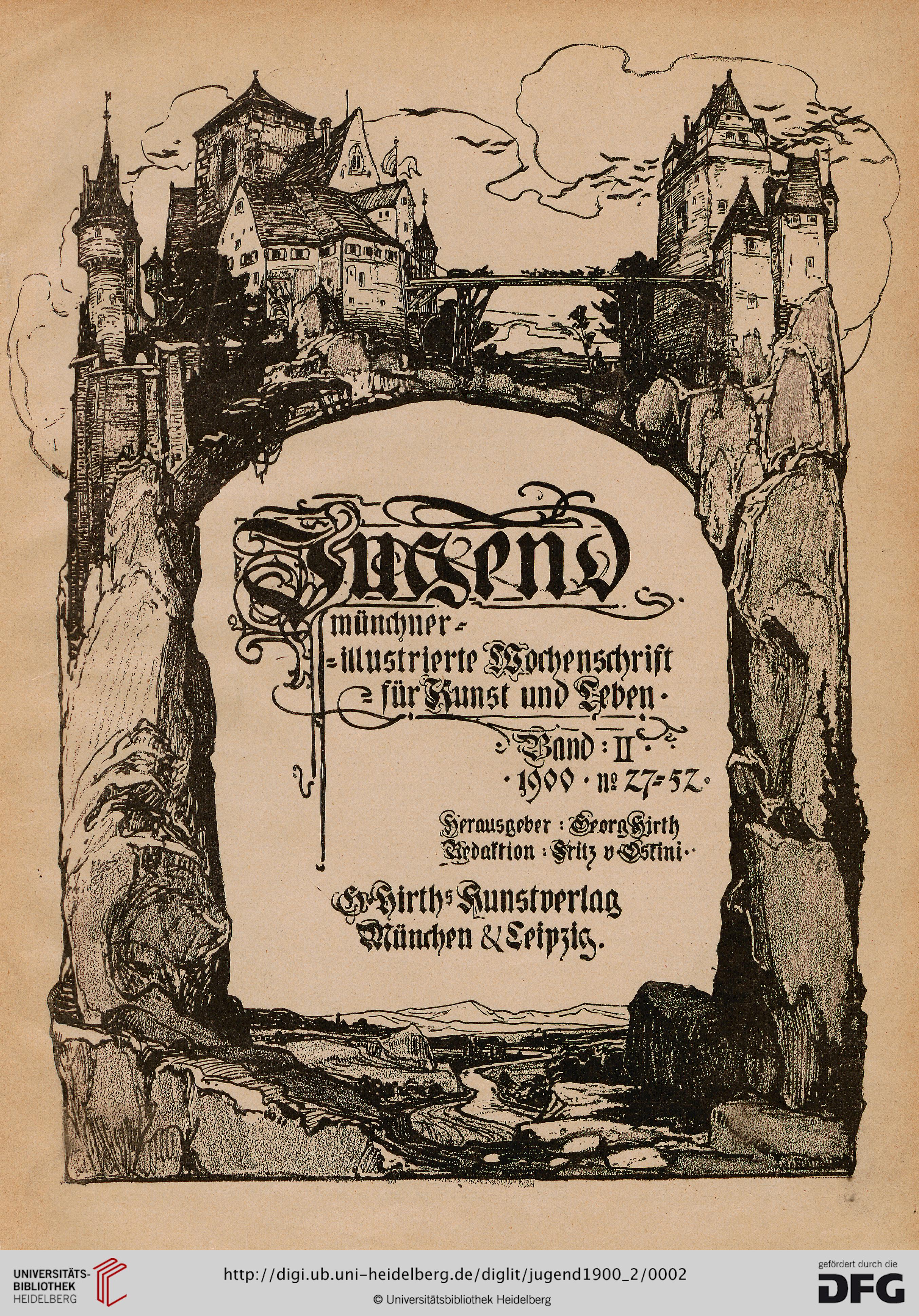
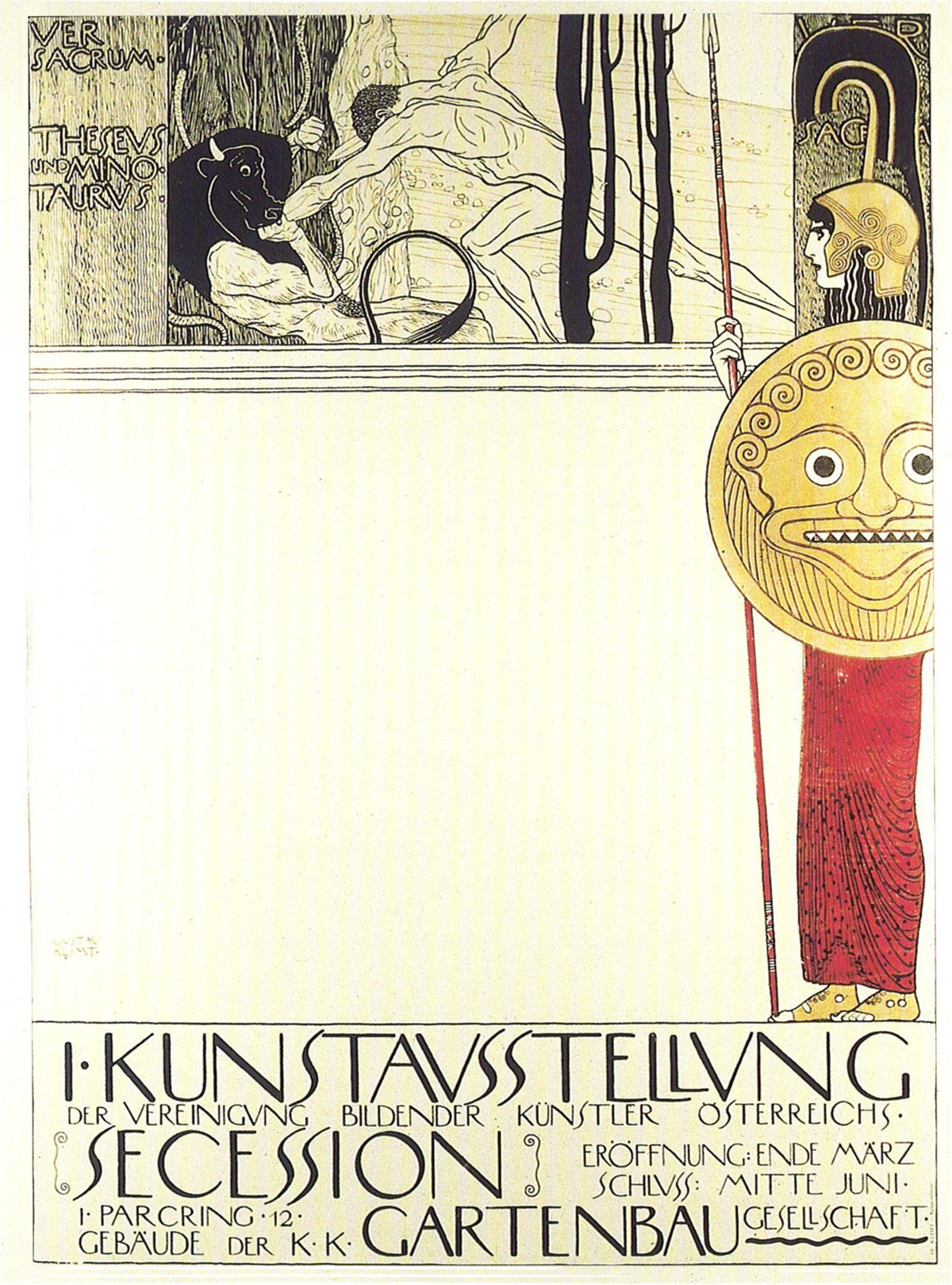
The Liberty style, also known as Art Nouveau or Floral style, borns in the last decades of the XIX century and drives a part of the art and of the print until the first decades of the XX century. This style has reached its most famous and impressive results in the decorative and applicative arts. Nonetheless, typography has been influenced by this artistic taste, fact which is clearly visible in two cases. In most cases the relevant pictures and decorations of both magazines and books were assigned to artists. At the same time some of the best known works of the liberty style are typographic works: advertising posters. This style aims to obtain a sort of manneristic realism, in a way which recalls the arabesques and the harmony of the shapes of the painter Raffaello. The realism of the paintings and of the typography is influenced by the innovations of that historical period, characterised by the development of technical and industrial processes. The name Liberty itself, comes from the Liberty company, which was one of the first companies to mass produce objects with this style and which, for antonomasia, gave the name to the style itself.
The most relevant features of this art are the decorative elegance, the linearism and the use of asymmetry and of abundant floral decorations. The pages are rich of pictures and floral reproductions either stylised or curated and coloured. The liberty style has been defined by the critiques 'the style without style'. This is due to the fact that the reproduction of the lines, figures and natural elements is of free interpretation and lacking in stylistic rigour. Moreover the typographer was allowed to great freedom in the composition of the page. In particular it was guided by the presence of flowers and other ornamental elements which, in some pages, have a great relevance with respect to the general layout.
Font and measures
General assumptions
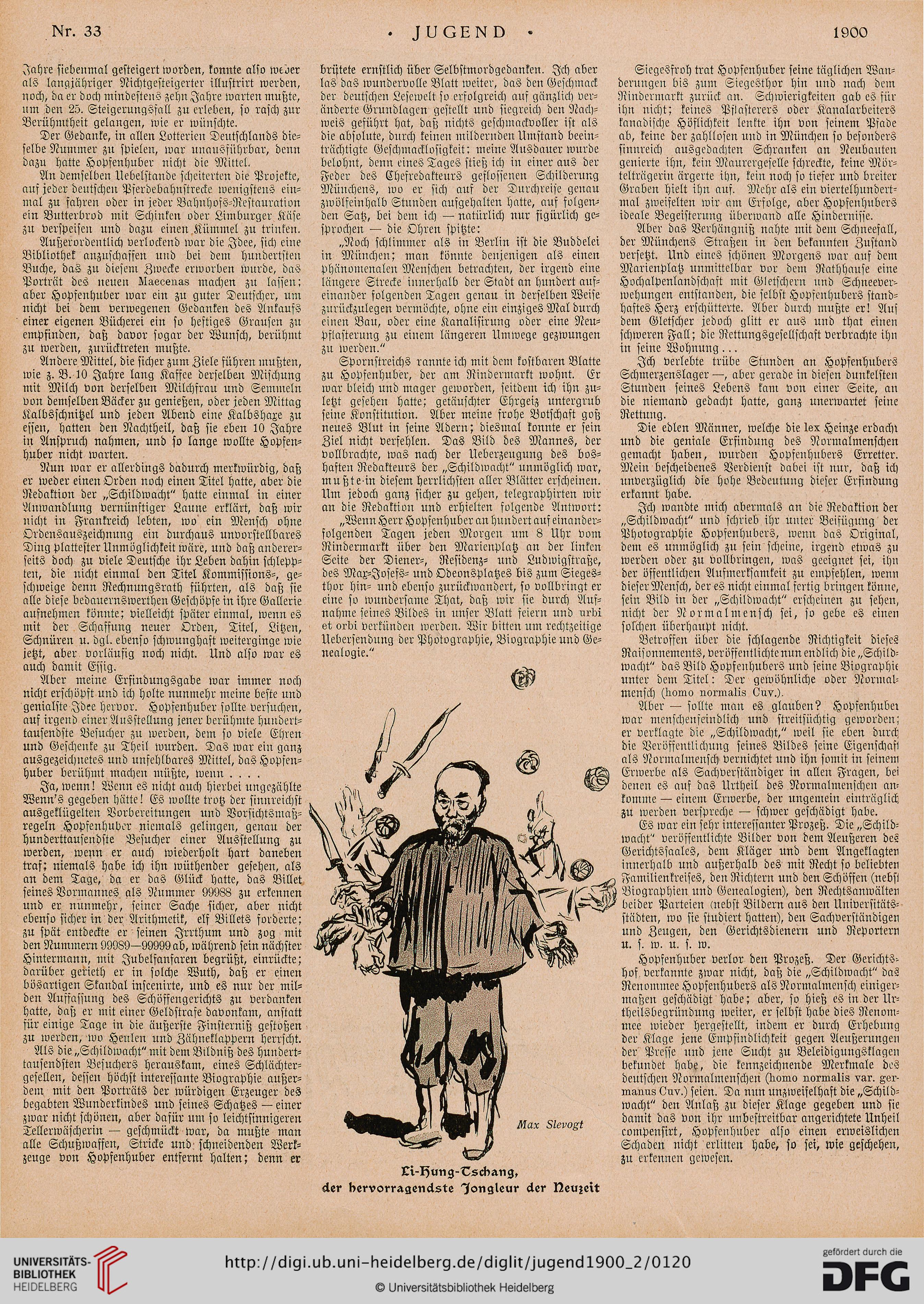
Stylisation is one of the main characteristics of the Liberty style, both for the word style and for the page layout. The text is usually divided in columns (two or three) which sometimes are surrounded by floral framework. There is extreme freedom in the choice of the number of columns, style and font of the letters. In certain cases this freedom leads to a certain difficulty in reading the text. So usually, while there are big font sizes for headings and titles, the text has small sized fonts and small spaced letters. The floral decorations have a main role in the distribution of the spaces between the page elements. They can either surround the text or be located between the columns of the text. They can fill the space of an entire column, occupy half of entire page height or lay between 2 columns which adapt to the image size. For the purpose of a good readability some of these freedoms have been avoided in the articles, but have been used in the cover pages.
Font
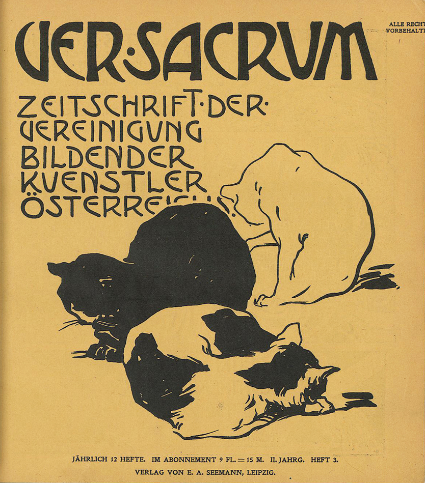
During the Liberty period many fonts were produced, some of them are still used because of their beauty. Still none of them could prevail on the oder, becoming the most representative of the entire movement. In the style of this magazine two families of fonts have been selected: ‘Auriol’ and ‘P22 Vienna Regular’. Both of them are known for being typographic fonts representative of the Liberty style. The first one takes his name from his creator, George Auriol which is considered the "quintessential Art Nouveau designer". He produced his fonts for the foundry G. Peignot et Fils. Nonetheless it has been selected because of its readability also for long texts, and also for its representativeness of the historical, artistic and typographic period. Inside this font family the choice fell on Auriol Normal for the text of the body and Auriol normal for subtitle and image descriptions. On the other hand, the ‘P22 Vienna regular’ has been selected because it is the style used as font for the cover page heading by one of the most representative magazines of the Liberty: the Ver Sacrum. the magazine has been founded by Gustav Klimt and, even if it had a short life, is famous because of the beauty of its pictures and for the novelty of its contents. This font, also in this magazine, has been used to reproduce the titles both in the cover page and in the articles since its shape is suitable for bigger font sizes rather than the small ones. In particular this font is useful since the foundry P22 creates digital fonts, so more adequate for screens rather than print, which is particularly suitable for reproductions like this one.
Layout
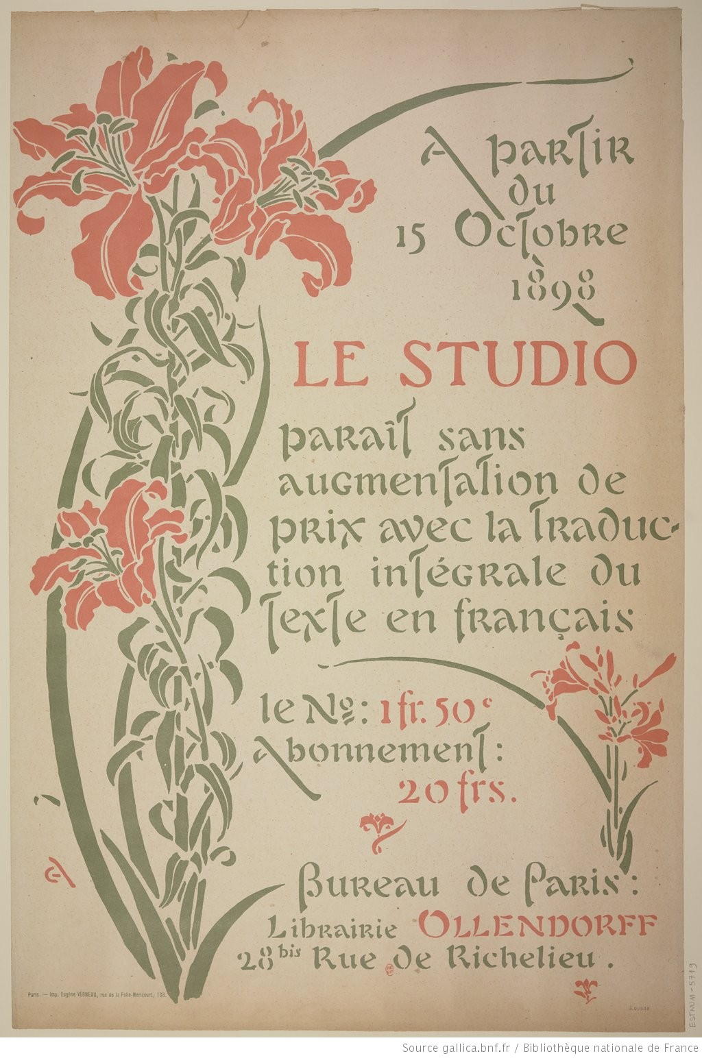
The layout of the liberty style is based on features derived from different magazines of the liberty period. The most relevant of them are the Ver Sacrum and the Jugend. For medium and large screens the cover page layout is characterised by the central position of the text, organised in a single column and included between an external floral framework surrounding it. The colours of the text and of the background are inspired from a lithography produced by G. Auriol. Also the proportions, between the different components of the text and of the page, are derived from that lithography. For small devices, instead, the floral frame is removed and is replaced by a small, liberty like, flower. This is due both for a practical and an aesthetically reason. Indeed in this way the text can occupy more space on the page and be more readable. At the same time, this allows to show how different two liberty shaped cover pages can be. Also the background color changes in light yellow and the writings color changes into black, with a soft white contour, in order to have a better visibility in this new layout. In this case it is more similar to one of the editions of the Ver Sacrum.
The articles are reproduced in three columns. This layout is inspired from the newspaper Jugend. For the purpose of readability the columns are reduced to two and one for medium and small screens respectively. The margins and the space between the columns are pretty small: the greatest part of the space is devoted to the text and to the images. In this particular reproduction, both for a purpose of readability and because of the constraints of CSS, the columns do not always have the same length even if it would be the norm in most liberty magazines. Instead it has been preferred the syntax correctness and content necessities.
The articles images are transformed with a strong black and white filter in order to resemble black and white drawings, typical insertions of Liberty journals. The first image is different from all the others: it is bigger and fills the space of all the columns. Its layout is inspired from many pages of the Jugend newspaper, where a lot of importance is given to some images with occupy a lot of space of the page in different positions. The remaining images have a smaller size. They fulfil the 100% of the column space, so either 30%, 45% or 90% of the article size. The figure captions are characterised by a smaller size, just like publication notes, quotations and all the elements external from the text. This is due to the fact that nowadays the block quotes are really long while, in that period they were short and could be characterised by a quiet larger font size.
The name of the author is located at the end of the article, as conclusive element, in a way which is typical for the newspaper of that historical period. Only in presence of a final publication note, the author is placed in penultimate position. In this case, even if not attested in the magazines articles, the publication note can be considered as the final element from a logical point of view, since usually it is a comment about the author, which is presented only at the end of the article.
Measures
All the measures have been inspired from Jugend for what regards the articles and from Ver Sacrum and some posters of the period (included one produced by George Auriol) for the cover pages.
- In the articles the title font size is pretty small, just 1.5 times the body size. The titles have no much relevance in the liberty magazines, but they are put in evidence also y the fact that the style is bold and uppercase.
- The subparts of the text like publication notes, figure captions, block quotes etc. have a smaller size than the main text. In the original Journal they actually are bigger but the captions are smaller, just one small phrase, usually including author, title and place. Because of the length of the modern comments the texts because of readability reasons need to have a smaller size (-25%).
- In the articles the text is divided in three, two or one columns. The greatest part of the page is devoted to the text and to the images. The white space is few both between the columns, and between the text and the margins of the page.
- margin space is also small. Since the page is considered as a left page of a magazine, the left part is bigger than the right one, but this difference is really small (left 2.5 times right, bottom 2 times right);
- line height must be quite wide. In particular in the cursive style there his the necessity of leaving a quite wide space between the previous line and the following one so that the ascender and descender line never touch.
- text indent: every paragraph has a an indent in its first line. The width is always the same since it is supposed that the width of the columns tries to be always in the same proportion.
Colors, ornaments and other aestethical features
One of the most relevant peculiarities of the liberty is the difference between inner pages and cover pages. Indeed the cover is usually decorated with hand made paintings created by artists with curated and colored figures. The titles are big, colored and rarely follow a precise scheme. This text may take different shapes and surround the images, juxtapose or overlie them. But at the same time they never become difficult to read: if they overlay an image, then a special contrastive shadow is added, the scheme at the basis of the phrases composition follows straight lines. What change are the fonts, the place where paragraphs of text are located and the number and colors of the pictures. The internal pages instead rarely present such curated and colored images. The text is sometimes surrounded by floral frames, or, in most of the cases, interrupted without a scheme by black and white pictures or floral elements. In this case the text never overlaps the images, even if some images occupy more than the size of one column, the text follows and adapt to the shape of the images and maintains its general readability.
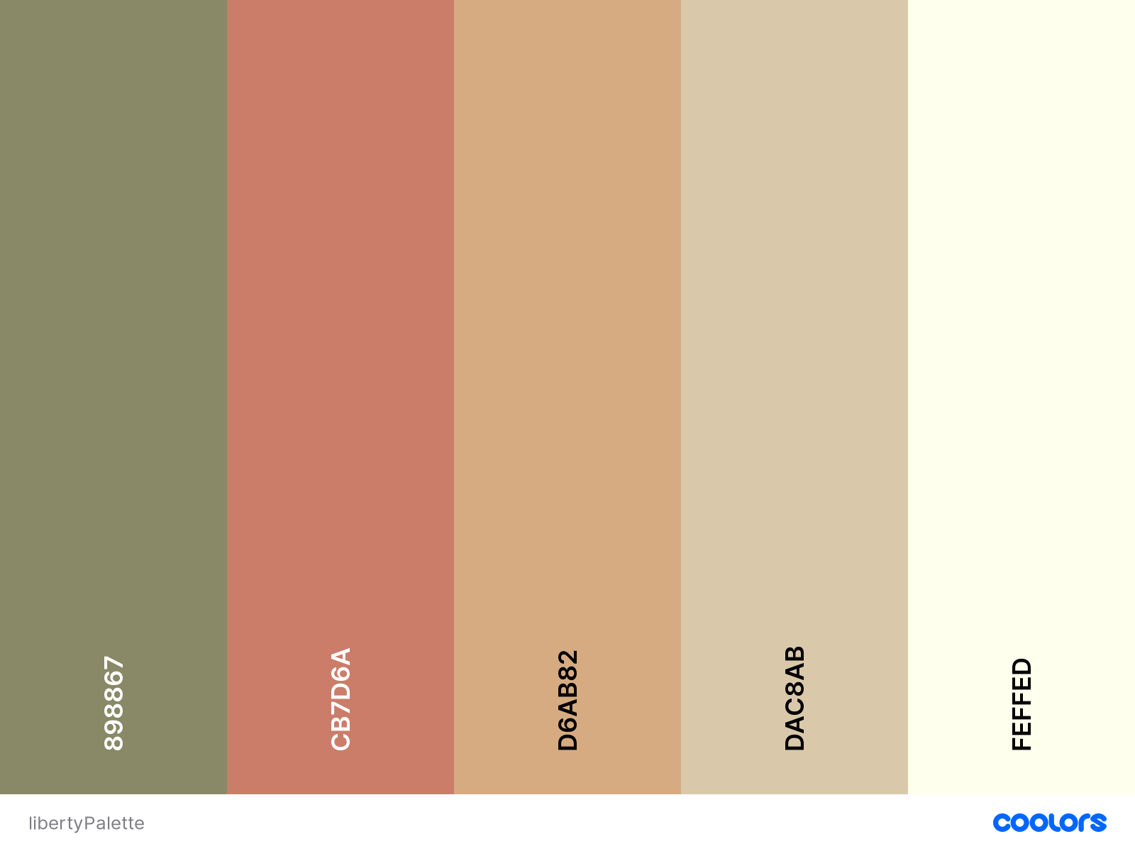
As a consequence, there is a strong difference of color palettes. The cover pages can have either grayscale palette or many different color palettes contemporaneously. In this style the predominant colors for the backgrounds are dirty white (#FEFFED), light brown of old paper(#DAC8AB). For what regards the text the main colors are the black(#44413C), red(#CB7D6A), green(#898867) and dark brown(#D6AB82). Finally the decorations and the images are characterised by blue, green, red, black and white colors.
Sources
Luigi Fumanelli, 'Il carattere nella storia e nell'arte della stampa'.
https://www.idesign.wiki/wp-content/uploads/2015/10/ver-sacrum-cat.jpg
https://digi.ub.uni-heidelberg.de/diglit/jugend1900_2/0009/image
https://digi.ub.uni-heidelberg.de/diglit/jugend1900_2/0032/image
https://www.pde.it/2018/11/09/ver-sacrum-da-klimt-al-futuro-la-bellezza-tra-le-pagine/
https://digi.ub.uni-heidelberg.de/diglit/jugend1900_2/0017/image
https://digi.ub.uni-heidelberg.de/diglit/jugend1900_2/0120/image
https://digi.ub.uni-heidelberg.de/diglit/jugend1900_2/0365/image
https://digi.ub.uni-heidelberg.de/diglit/jugend1900_2/0128/image
https://www.clipartmax.com/png/middle/174-1748085_art-deco-flowers-art-deco-flower-clipart-41-bee-balm-art-nouveau.png
https://digi.ub.uni-heidelberg.de/diglit/jugend1900_2/0002/image
http://histoire.typographie.org/auriol/peignot-auriol.html
http://www.typographie.org/histoire-imprimerie/peignot/peignot-auriol.html#
https://gallica.bnf.fr/ark:/12148/btv1b10506413c
http://www.eyemagazine.com/feature/article/a-tradition-with-breaks
http://www.typographie.org/histoire-imprimerie/peignot/specimen-grasset.html
BAUHAUS
The style
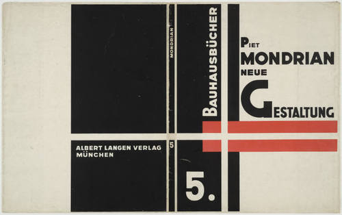
The Bauhaus was a school art founded in 1919 by Walter Gropius that would remain in operation for only 14 years, closing under the pressure from the Germany's Nazi regime. However the school’s ideology and founding principles lived on in the Bauhaus movement, which had a monumental impact on art across a spectrum of disciplines, from architecture to graphic design to typography. It established the modern age style principles in the Europe of the 1920s. The Bauhaus become in fact a study and research centre and a tool to spread modern artistic forms mostly applied to mass production. Indeed the crafts crisis contributed to lowering the artistic taste level and general culture. The only way to remedy was the use of mass production at the service of the society. Gropius wanted to create a new metodic process that could create objects that were at the same time functional, but also artistic. A new Typography was born, one that abandoned the pravailing classical layout conventions, it was a simultaneous experience of vision and communication, all typefaces, type sizes and geometric forms were used to guide the viewer's eye. Its motto was "Form follows function", the priority was an unequivocal clarity in all typographical compositions, so it was imprinted on minimalism. The study of the communicative potential of letterforms and typographic layout lead to many innovations such as the elimination of capital letters, the replacement of the archaic Gothic alphabet used in German printing by a modern "cosmopolitan" font, and the concept of composition based on strong geometrical elements and expressive values of colors. These changes testify the movement towards objects meeting functional requirements suitable for mass production, in order to meet the needs of society and to create a new lifestyle.
Font and measures
General assumptions
Clarity, minimalism and the use of geometric shapes and colors are the main characteristic of the Bauhaus style. It is characterized by sans-serifs typefaces easily legible, the use of exclusively lowercase letters (they can be treated like two different alphabets, so it is better to use them in parallel but not mixed), the combination of horizontal, vertical and diagonal text, and asymmetric layouts. Also, there are no pointless decorations and simple lines prevail. Tschichold's advocacy of lower-case typography (KleinsciJreibung) and a reformed orthography was first made in his elementare typograpiJie manifesto of 1925: "An extraordinary economy would be achieved through the exclusive use of small letters - the elimination of all capital letters; a form of wr'iting and setting that is recommended as a new script by all innovators in the field."
Font
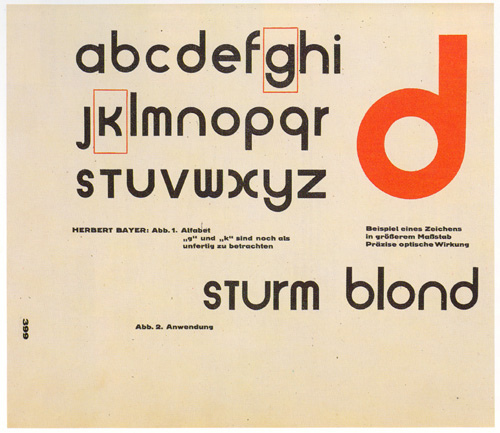
The workshop of Herbert Bayer, teacher of the Bauhaus school, has definitely left a huge mark on typography and other visual arts of the period. The output almost exclusively used sans-serif typefaces, and Bayer experimented with crisp and geometric typographic compositions and introduced innovations in constructivist and functional design, adopting the principles of reductive Minimalism. In 1925, Walter Gropius commissioned Bayer to design a typeface for use in all official communications by the Bauhaus school. Bayer designed an “idealist font”, the Universal Typethat perfectly enbodied the Bahuaus principles, it was in fact sans-serif (serifs were considered unnecessary) and had only lowercase letters (capital letters were considered redundant, and if spoken word does not require two cases, so should the written one). However this typeface was never finished and used. So i decided to use Ronda regular for the text, choosing it from the list of Bauhaus typefaces of Linotype, it is a sans-serif font that reminds of the Universal Type of Bayer, with a design accessible to all and easy to read.
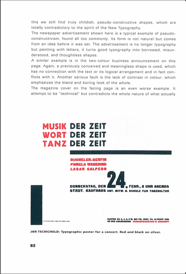
In the "New Typography" Jan Tschichold pointed out that "Besides the exclusive use of lower case for text can be seen the use of capitals alone for headings and vice-versa, [...] the two alphabets of roman are really two different styles, and should be used in parallel, but not mixed." This is why for headings i instead used the font Bauhaus 93 (putting it in upper case) created during “The Hidden Treasures — Bauhaus Dessau,” a campaign led by typeface designer Erik Spiekermann to turn fragments and sketches from the Bauhaus archives into functional fonts for Adobe Typekit. The same font has been selected for titles of pharapraghs, but in this case it is written in lower case.
For image descriptions the choice fell onto the P22 Bayer Universal, a 1997 digital font that approximates letters drawn by Herbert Bayer at the Bauhaus (Original designers were Herbert Bayer, Denis Kegler and Richard Kegler).
Layout
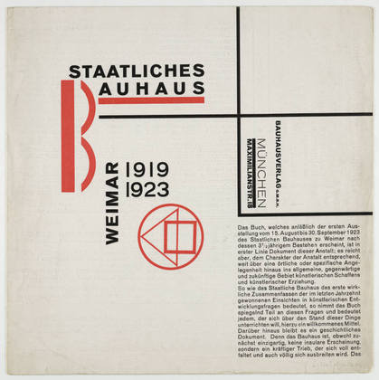
The aesthetics of the Bauhaus has influenced many important artists, among them Jan Tschichold, the man who created visual experiences on a subconscious level. After seeing a Bauhaus exhibition in 1924, he adopted the composition, structure and geometry of the Bauhaus. In 1928 he published The New Typography, that became the major reference book of the modern typography and graphic design. Most used practices include lowercase, sans-serif type, few symbols, thinner rules, asymmetric layout, but not chaotic.
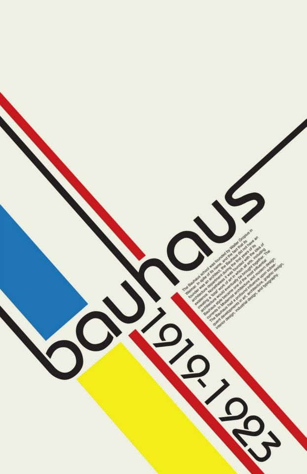
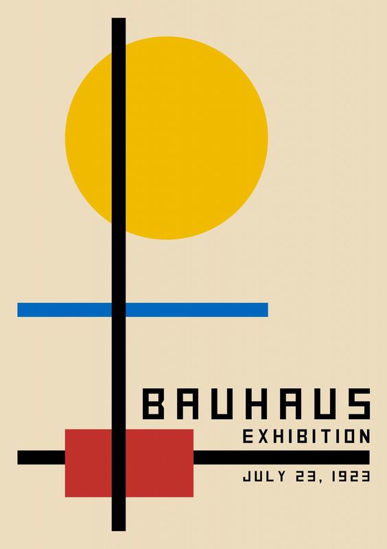
The inspiration for the cover was taken from a poster of the Bauhaus characterized by straight lines, contrast between font sizes and diagonal words. In Bauhaus design, even though "Form follows function", the functionality needn’t be boring, so i choosed a modern Bauhaus inspired image for the articles' header, created by Danilo Campos as a tribute to Bauhaus 100 years anniversary (https://www.bauhaus100anos.com.br/en/poster/3).
Text in books was often justified, filling columns with wider spaces between letters and words. Contrast between font sizes was used to establish visual hierarchy at fisrt sight. Lines, bars, circles and squares were used to divide up space and guide the eye through the composition.
The "New Typography" of Jan Tschichold was the basis for all the other layout choices:
- Article headings and figures should be on the left and not centered
- Asimmetry must never be disturbed by centred titles or forms
- Captions should be flush left
Measures
Tschichold recommended a 2:3 page-size ratio that would be clear, intentional and definite. The margins proportions of the layout page recommended are: 1:1:2:3 so i adopted these measures imagining that the webpage was the first page of a magazine, so with the outer margin on the right side:
- margin-left measures 10vw - as the inner margin is the smallest one
- margin-top measures 10vw
- margin-right measures 20vw - as the outer margin is the bigger one
- margin-bottom measures 30vw
I followed Tschichold's principles also for:
- the position of the heading is not centered, but on the left to create asimmetry
- image descriptions are slightly smaller than the text to maintain the contrast between font sizes
- the proportion of the primary heading is 180% of the text, while h2 is 170% and h3 is 150% so:
- when text = 0.9em, h1 = 1.62em, h2 = 1.53em, h3 = 1,35em
- when text = 0.8em, h1 = 1.44em, h2 = 1.36em, h3 = 1,2em
- when text = 1.5em, h1 = 2.7em, h2 = 2.55em, h3 = 1,50em
Colors, ornaments and other aestethical features
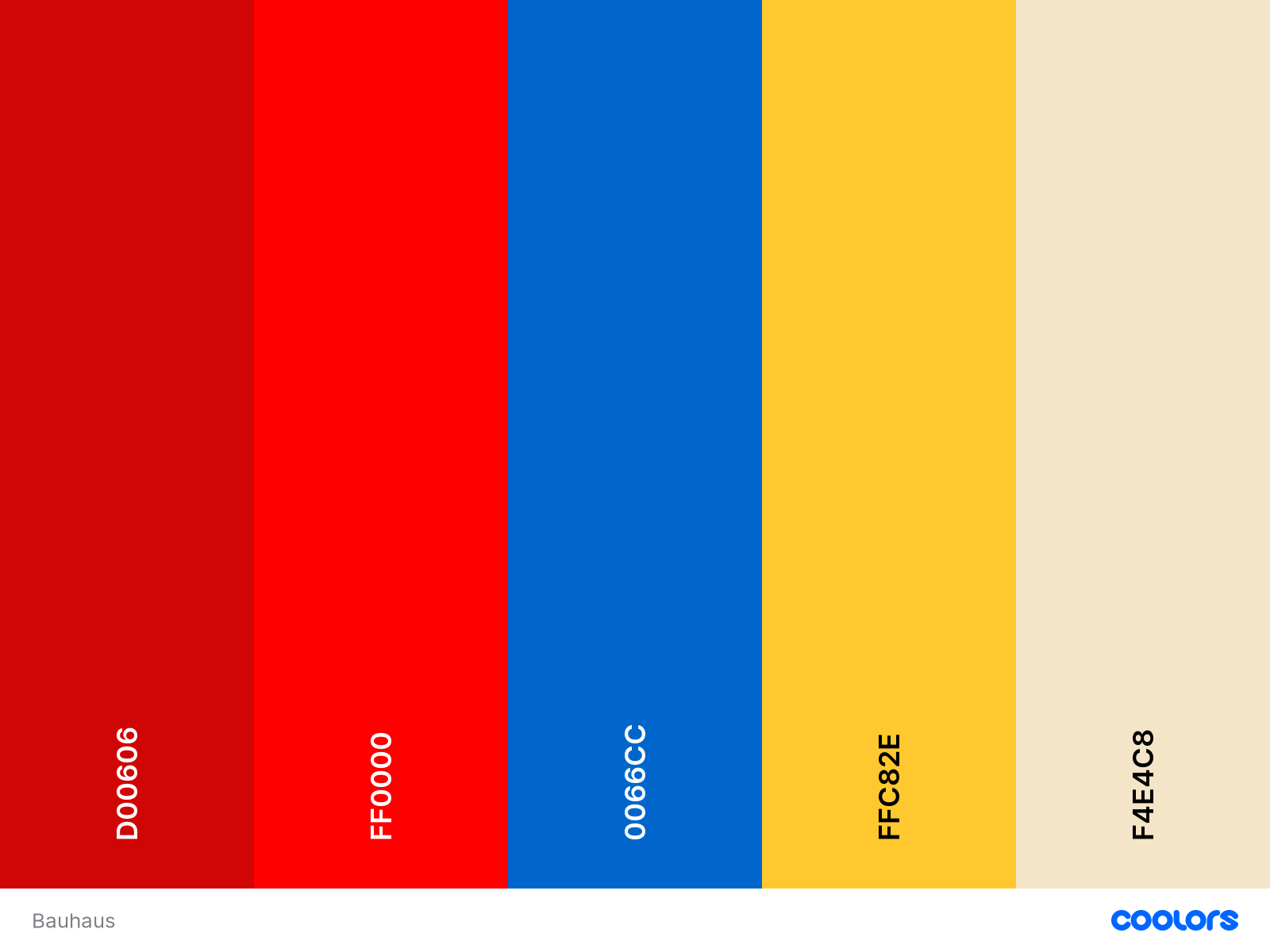
In Bauhaus design color is used functionally, the physiological effect peculiar is used to each color to increase or decrease the importance of a block of type. Some white has been added to image descriptions because white has the effect of reflecting light, so it shines and draws attention to it. To highlight elements, like the beginning of the article, citations, publication notes and the first letter of each article title on the cover, red was selected because it seems closer to the reader, it comes forward and consequently, the eye tends to be attracted to it. It is the same color used to higlight words connected to metadata throughout the articles: hovering the specific word with the mouse, it will become red. Pure red, yellow and blue, unmixed with black have been choosen for the overall layout since they are generally preferred by Bauhaus designers because of their intensity.
Sources
https://resnicow.com/client-news/
jan-tschichold-and-new-typography-graphic-design-between-world-warsJan Tschichold, Ruari Mc Lean, Robin Kinross, The New Typography, 1998, Berkeley, Los Angeles, London, California Press
http://guity-novin.blogspot.com/2012/04/modern-newspaper-magazine-layouts.html#Seven
https://nadinechicken.wordpress.com/tag/herbert-bayer/
http://www.typeoff.de/2011/08/some-thoughts-on-geometric-type/
https://fontsinuse.com/uses/5/typefaces-at-the-bauhaus
https://www.pixartprinting.co.uk/blog/bauhaus-caracter-universal/
https://www.bauhaus100anos.com.br/en/home
(per immagine cover page)https://hyperallergic.com/447809/unfinished-bauhaus-typefaces-adobe/
https://vimeo.com/276095832
http://www.designhistory.org/Avant_Garde_pages/BauhausType.html
http://www.oac.cdlib.org/findaid/ark:/13030/kt5t1nf2n2/admin/
https://www.widewalls.ch/magazine/typography-history-art
https://letterformarchive.org/news/periodicals-as-collections-02
EARLY EIGHTIES
The style
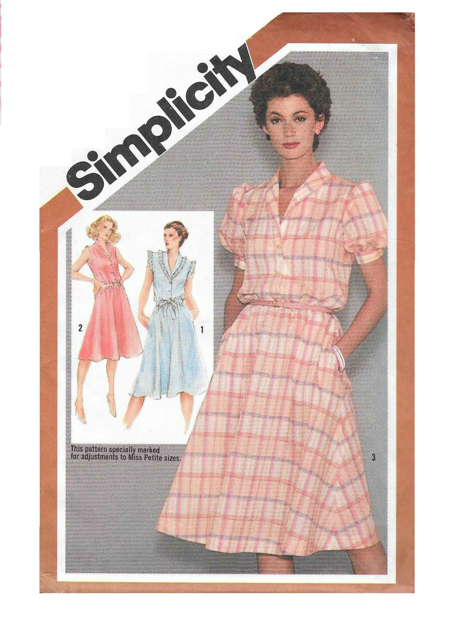
This style takes inspiration from the multiple trends happening in the period between the end of the 70s and the start of the 80s. At the beginning of the 1980 the world was about to welcome the digital revolution of the graphic-design discipline. The invention of the personal computer and the widespred accessibility of the tools of dekstop publishing would have allowed for a creative surge to hit the design world and PostScript (mid 1980s) would have made the recreation of traditional fonts into digital fonts easy. But the revolution is just beginning, the style of this period is yet attached to the tradition, yet looking towards the future. This style resembles the overall serious look magazines of the early eighties. It is chatacterized by an airy lay-out with broad white margins contrasted with the more crowded columns, with small margins, there to stress the dramatic intensity of the articles. In this period it was indeed realized that the architectural cage structure of a periodical holds a content which is more volcanic and explosive, figuratively speaking, than that of any other type of publication.
Font and measures
General assumptions
70s was a disco-infused decade and an era when everything was bigger than life. For many the seventies were the Golden Age in type design: bold and groovy, color, earth-tone palettes, uncompromising and human oriented typography and graphic design would lead the way to a decade which was literally out-of-the-box. 80s went further, this decade was an explosion of eclectic and unique ideas that went from clean and simple to eccentric and vibrant, especially when it comes to design.
Font
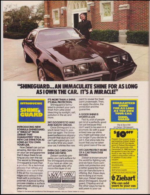
The typefaces used for this style are the perfect witnesses of this transition period between the seventies and the eighties. The selection includes 4 different typefaces to better represent the variety of styles and trends used in the magazines of the period. The serif font used for the body is Cheltenham Book Regular that recalls the tradition and gives to the magazine a familiar nuance. The Cheltenam typeface was designed by Bertram Grosvenor Goodhue, assisted by Ingalls Kimball, director of the Cheltenham Press, who suggested and supervised the face. It was largely used in the early 80s in posters, magazines and book covers like Social studies by Fran Lebowitz. This font produces a reminescence of the 70s when bold types, outlines and swashes were common ways to reinforce otherwise simple designs. For titles the choice fell onto Lato Black a sans-serif font suitable to convey an idea of modernity, clean and stability that incorporates all the features of the time. In fact, although Lato is a typeface designed by Łukasz Dziedzic in 2010, it is conceived to provide a feeling of warmth through the semi-rounded details of the letters, but also stability and seriousness thanks to the strong structure. Since it is designed to display some original traits when used in larger sizes, it was the perfect choice for the headings. For subtitles and image descriptions have been selected the font Helvetica Neue Bold, more appropriate for smaller writings as we can see in the cover book of the above mentioned "Social studies". This font is member of Neue Helvetica typeface, fruit of the revision at Linotype in 1982 of Helvetica typeface. The last font used is UniversLTStd-Bold, similar to Lato, but more condensed, suited for the articles's titles positioned on the cover.
Measures
For the page layout margins i followed the tips of the editorial designer Eugen Coman. As he explains, "margins are not always symmetrical. Usually the bottom margin is bigger because it is used to place additional information useful for the reader’s navigation, such as the folio and page number, but they can also accommodate other type elements, like drop caps, short captions, and possibly small pictures. If this technique is used sparingly, it can help prevent the layout from looking boxy." It also helps to have a larger bottom margin so that pages don’t take on a bottom heavy look. The top margin should be 1.25 to 1.5 times bigger than the inner margin, while the bottom one should be 2 to 2.5 times bigger:
- inner margin, (the left one) measures 2vw
- top margin measures 3.5vw
- outer margin (the right one) measures 8vw
- bottom margin measures 4vw
The number of columns in the magazines of the historical period is not fixed, so, for reasons of readability, i choose to display the text in 3 columns for bigger screens, 2 for medium screens and 1 for smaller screens. The leading, distance from one baseline to the next, is tight and consequently it increases the type density, making the content feel more authoritative. Even the word spacing and the margins between columns are reduced in order to mimic the use of the period. The font size recommended is between 10 and 12 pt, i converted it in em so:
- the text in 0.9 em
- while the heading is 3em to reproduce the size difference of the magazines that i took as examples
- the subtitle and titles of paragraphs measure 1.01 em
- image descriptions measure 0.9 em even if they should be smaller than the text because of the dimension of its font
- heading measures 9 em
- articles' titles measure 2 em
Drop caps are indented, subtitleßs are written in italics like quotations, although the latter are in a darker black.
The date of the publication is not usually present, so i put it before the subtitle all to the right to keep it similar to the position of the name of the author, but on top of the page rather than of the bottom. In fact the name of the author of each article is placed at the end of the page, as it happens in the magazines of the period, is it followed only by the publication note, when present.
Colors, ornaments and other aestethical features
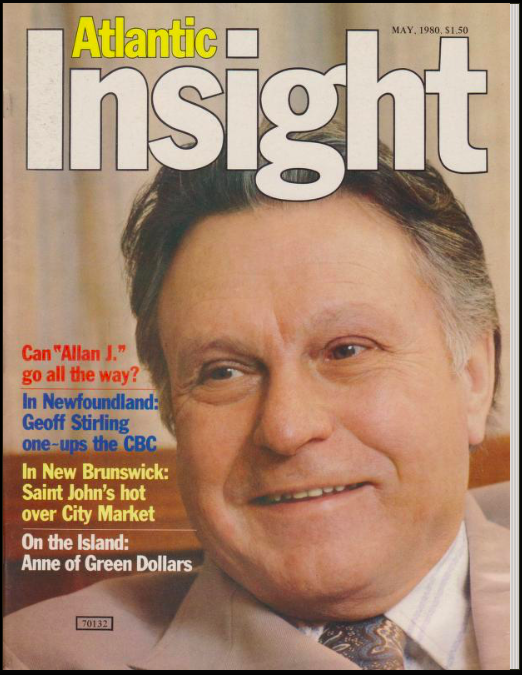
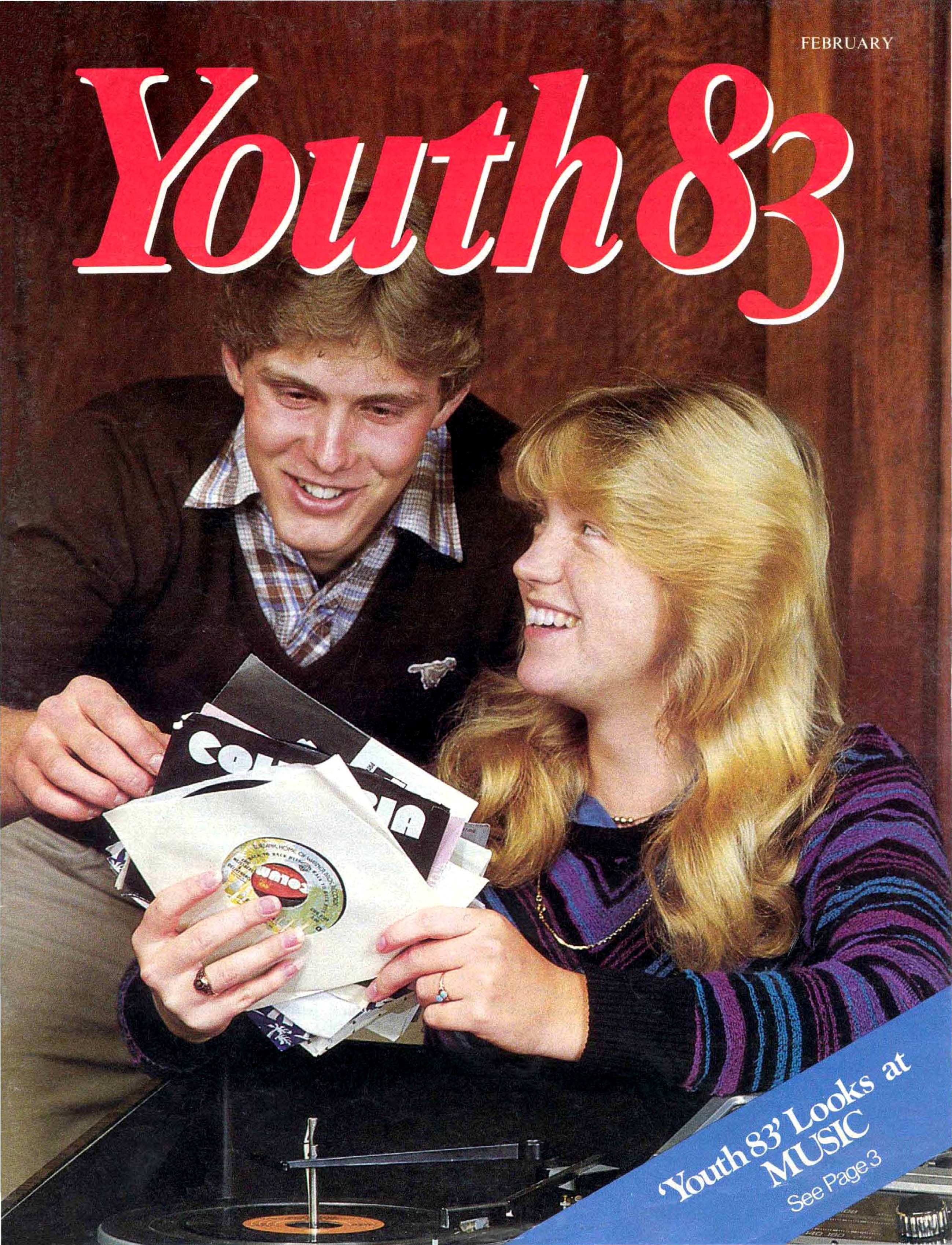
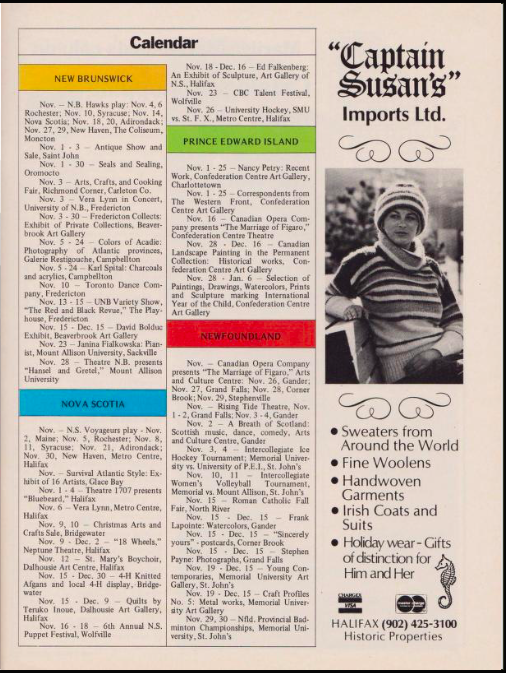
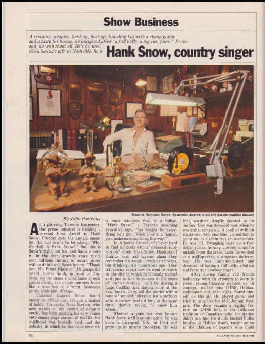
The inspiration for this style mostly comes from the magazine Atlantic Insight (inaugural issue: April 1979) that became the most influential magazine in the Atlantic Provinces during the early eigthies. Within eight months of its launch, Insight had 50,000 paid subscribers. The magazine was different, graced with colors at a time when many magazines weren't and had a clean design. But, yet, it was familiar. A reminescence of the 70s was given by the decidedly non-disco market Earth-tone palettes, that i choose to recreate in the filter of the images, the background of the article page and both heading and picture on the cover. This one is an half-lenght photo, because most of the magazines of the period used close-up and half-length photos that take up most of the space of the cover. Regarding the aestethical features that evoke the new era, one of the most outstanding is definitely the use of strong bright colors. The use of many different colors in design emerged in the late 70s as they represented a positive and happy vibe. In interior design for example, for every drab earth-toned room there was an equally colorful one, creating an "explosion of color" as the architect Conroy said. However the 80s took a step further: colors became neon, fonts bold, with thick borders or shadows. Nonetheless in this decade there were multiple trends happening, indeed besides electric colors inspired by technological advances, pastel colors were still used. In order to harmonize all these features, bright colors have been selected to shine and draw attention on them in the titles of the articles, positioned to the right of the cover (further highlitgthed with a brigth light blue when hovering them with the mouse) like usually in this period. The same coloring strategy has been implemented to highlight the metadata throughout all the articles: hovering them with the mouse, will make them jump out of the text. Returning to the cover, the title is big, clear, simple, yet captivating with thick colored edges and a shadow effect, representative of the revolutionary style that will fully emerge during the 80s.
Sources
https://halifaxmag.com/cityscape/29089/
https://medium.com/@CorrainiEd/the-years-of-the-great-change-1970-1980-the-shape-of-the-art-of-publishing-in-the-80s-c08d91b0932
https://www.afka.net/Mags/High_Times.htm#1980Mar
https://archive.org/stream/commodore_computer-club_2/Commodore%20Computer%20Club%202#page/n5/mode/2up
https://www.mentalfloss.com/article/63141/11-delightfully-dated-80s-magazines
https://creativepro.com/scanning-around-gene-part-1-70s-type/
https://seraphadesign.wordpress.com/2018/12/04/research-1980s-typography/
https://www.apartmenttherapy.com/american-style-150743
https://fontsinuse.com/uses/35054/social-studies-by-fran-lebowitz-random-house-
https://fontsinuse.com/typefaces/44/helvetica
https://fonts.google.com/specimen/Lato#standard-styles
http://legionfonts.com/fonts/universltstd
https://www.flip180media.com/tips-for-periodical-publishers/magazine-layout-design-mistakes-white-space/
https://www.typeroom.eu/article/boogie-lines-ulc-and-more-sexy-type-made-seventies
https://issuu.com/feipusong3/docs/history_booklet
THE NINETIES
The style
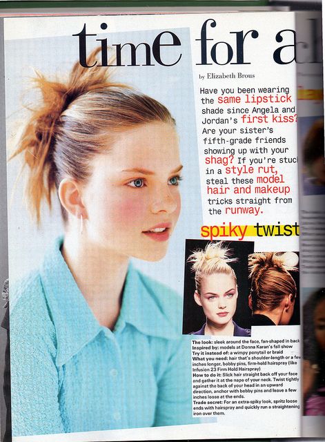
What if nineties teen magazines had CSS3?
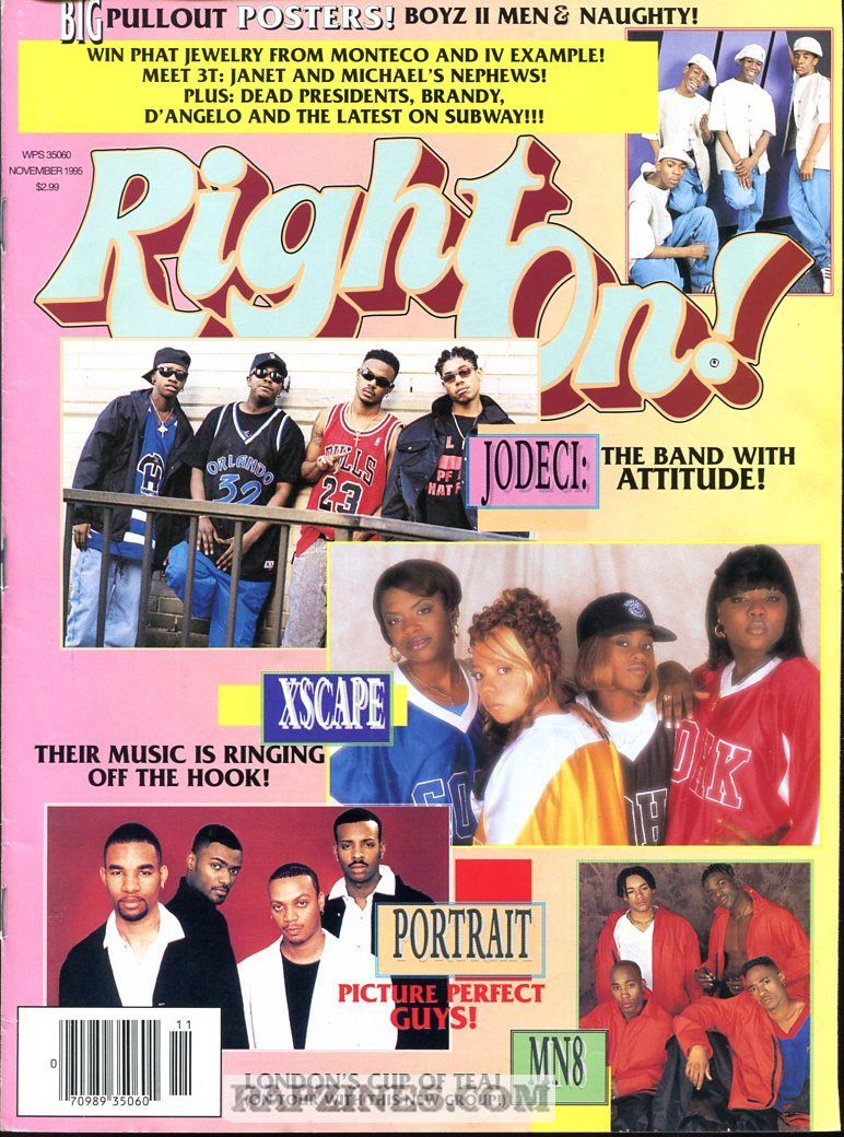
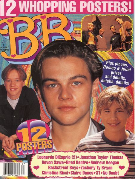
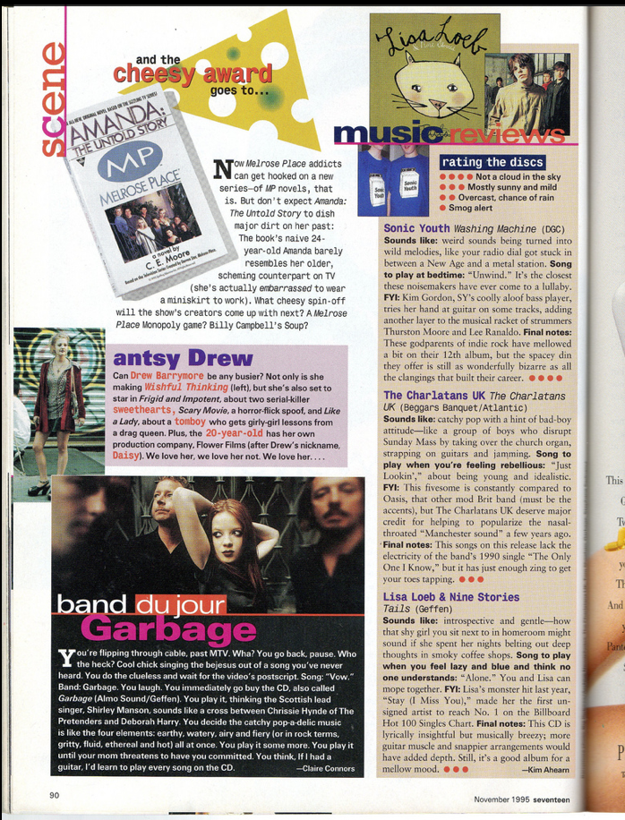
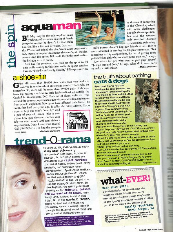
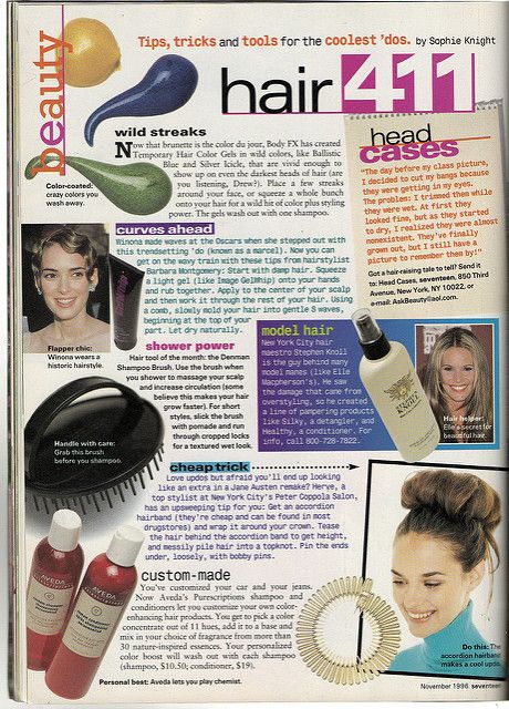
Starting from the end of the eighties, teen magazines typographical style has drawn to really specific features: from experimental layouts to geometric figures as ornamental elements, to handwritten fonts and really bright colors. Indeed, the evolution of the typographic style of magazines for teenagers is part of a broader stylistic change that has affected the entire world of magazines since the end of the 1980s, in which many designers and magazines had decided to embrace formal experimentation as a mode of critical inquiry, contesting values of legibility and order. As for teen magazines, they certainly differ from the more experimental and purely artistic trends of this period, but are affected by this change, which emerges above all in the non-linear arrangement of the text and its components; and in the exaggerate use of several colors and different outstanding fonts. In contrast to the presentation of the text in a linear and formal way, the pages of teen magazines often present a layout organically composed of different text boxes with unrelated colors and fonts, and above all rich in images, which may be outlined or overlapping, or their subject is cut out. In this overlapping of elements, forms and media, a typographic style is defined with a precise editorial purpose: to capture the attention of a new generation of young readers.
Font and measures
General assumptions
In the absence of univocal information on the measures to be taken, given the enormous variability of the style, some digitizations of 90s teen magazines, mostly british and american ones, has been used as main example for deductiong measures and proportions in the page layout. Reference magazines are CosmoGirl, BOP, Teen Beat and Seventeen.
Fonts and Typefaces
One of the defining features of 90's teen magazines is the excessive use of typefaces of different styles and sizes. Indeed, it is quite impossible to define the most used fonts, as they varied a lot with respect to the editorial style and magazine content. By the way, we are can distinguish two large sets of font families used for different purposes:
- decorative fonts, exgerated, cinematic and media-inspired for titles, subtitles, blockquotes and in general all those elements that had to capture the reader's attention, right from the cover page. Therefore, for titles were used three decorative fonts: Heartbit, Lifesavers and Ageta Chubby for the cover page. These are all heavy-weighted fonts and some have had further text transformations applied and additional font styles applied (e.g. Ageta Chubby is in italic). A great trend of the nineties among decorative fonts are handwritten fonts: for this style Sedgwick Ave was therefore chosen for the figure captions. The last eye-catching font selected for this style is the rugged an wavy Shmup, more representative for that aesthetic or mood that generally identifies the 90s;
- simple, clear fonts but with a bit of character (we're still in the 90s anyway) for the actual text of the article, to make it easily readable by an audience of mostly non-regular readers. For this reason, Portland LDO is the typeface in use for the text body: thin but still a serif.
Measures
The large and sometimes excessive dimensions of the titles (especially in the covers) correspond to texts with small fonts, creating a very unbalanced proportion: 58px for h1 titles (up to 150px for the h1 title of the cover page!) and around 16px and 18px for text body (for what concern screen sizes bigger than 800px). There are no precise rules regarding the relationship between text size and paratextual elements, such as figure captions and blockquotes. Generally the latter are larger, so they have been given a font size of 18px compared to 16px for simple paragraph.
As regards the line height and margins width, the typographic philosophy of teen magazines in the 1990s was to leave little or none blank space on the page. There has been a designer-led trend towards closer-fitted text in general: the flow of the text, compact and narrow, is constantly accompanied by images and other ornamental elements. For this reason the dimensions chosen for the margins are: 0.5em 1em 0 1em, so the bare minimum to ensure readability on screen; and the line-height sometimes occurs to be minor than 1 (e.g. the title of the cover page or the h2 and h3 titles within the articles)! Letter-spacing is not as tight, if not in the titles, in which overlapping letters and lines with negative letter-spacing and line-height dimensions create a confused and suffocating effect typical of this historical theme.
For what concern images, they have been given sizes smaller than half of the screen (for big screen sizes) so that they are inserted within the flow of the text, creating that effect whereby text and images converging creating a whole
Layout
Even with regard to the more general layout choices, some specific magazines have been taken into consideration: CosmoGirl, BOP, Teen Beat and Seventeen.
There are no strict rules for layout in this historical typographical theme, only major style streams and frequent stylistic and editorial choices in all types of press of the period. Chaos, randomness and disorder were the keywords of a style with certain constant but never definitive stylistic characteristics.
Colors, ornaments and other aestethical features
Colors
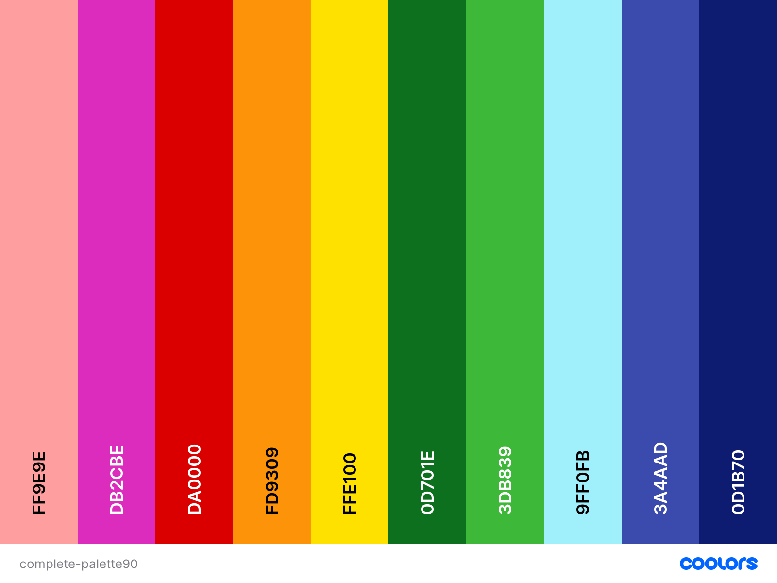
80s teen magazines were invaded by pastel, flash or neon colors. Although in the early nineties some of these colors remain partially as background or decorative colors of some elements of the internal pages, other colors are starting to gain more importance. These are primary colors, vivid, full, bright. It is rare to find mixed colors, particularly light or dark ones: the most common are those with high hue contrast (rarely colors with same hue are repeatetly used), high chroma (they are very shiny, vivid with little block or grey present) with occasionally contrast of value (some colors might be a little brighter than others). For all these reasons, the colors chosen for this historical theme are:
Decorations and graphic elements
Main decorative elements are:
- Box and text shadows, as well as dashed, wavy, ridged borders - also to separate text from busy backgrounds;
- Borders and different background colors for paragraphs: the reading of the articles in this type of magazine is discontinuous and fragmented, the paragraphs are often graphically displayed independent of each other even if they are not so in terms of content;
- Familiar and human style for some graphic elements: from the font for the figure captions to the decorative elements of the blockquotes (pieces of tape and paper clips), handrawn arrows and paper-like background for images.
- Overlay of text and images, both in the cover page and in the articles layout;
- Fun Patterns for image borders and background images: in the 90s patterns were everywhere!
- A glitter cursor and simple pointer have been added to recreate the aesthetic of this historical theme, a small detail to adapt it to the new media.
Transformation and animations
Several transformations of the page elements have been replicated as they were in the paper magazines. First of all, the rotation of images, texts and blocks in a range between -10 and 10 degrees to preserve legibility.
To update the theme to best fit the new media, some small animations have also been designed to accompany the animated images in .gif format of some backgrounds. If 90s teen magazines have had CSS3, they would have certainly exploited the infinite possibilities of animations, transitions and so on. The animations featured in this historical theme are the pulsation of the span elements when in hover and pulsation of the span elements when in hover and the shadow effect moving in circle for the paragraphs of the cover page: makes you want to click as soon as possible, doesn’t it?
Sources
- Typography in the 1990s
- Helvetica. Directed by Gary Hustwit, Swiss Dots & Veer, 2007.
- 10 Teen Magazines That Literally Every '90s Girl Read
- 90s Graphic Design Trends: From Aesthetic Fonts to Grunge Patterns and Rave Flyers
- History of letter spacing (Wikipedia)
- Books and Magazines from the 90's
- What I learnt from typography in the 90s
- 90s teen magazines
- Glossary for Colors
MINIMALISTIC FUTURE (2021-2025)
The style
Minimalism and Design
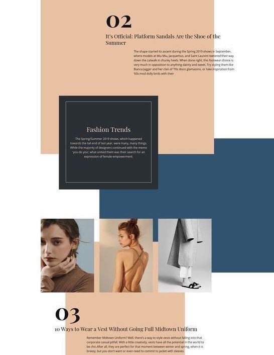
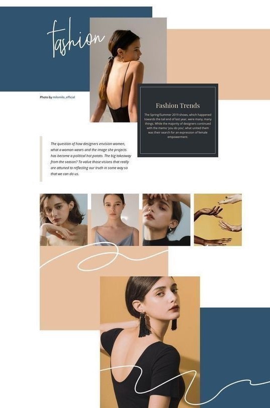
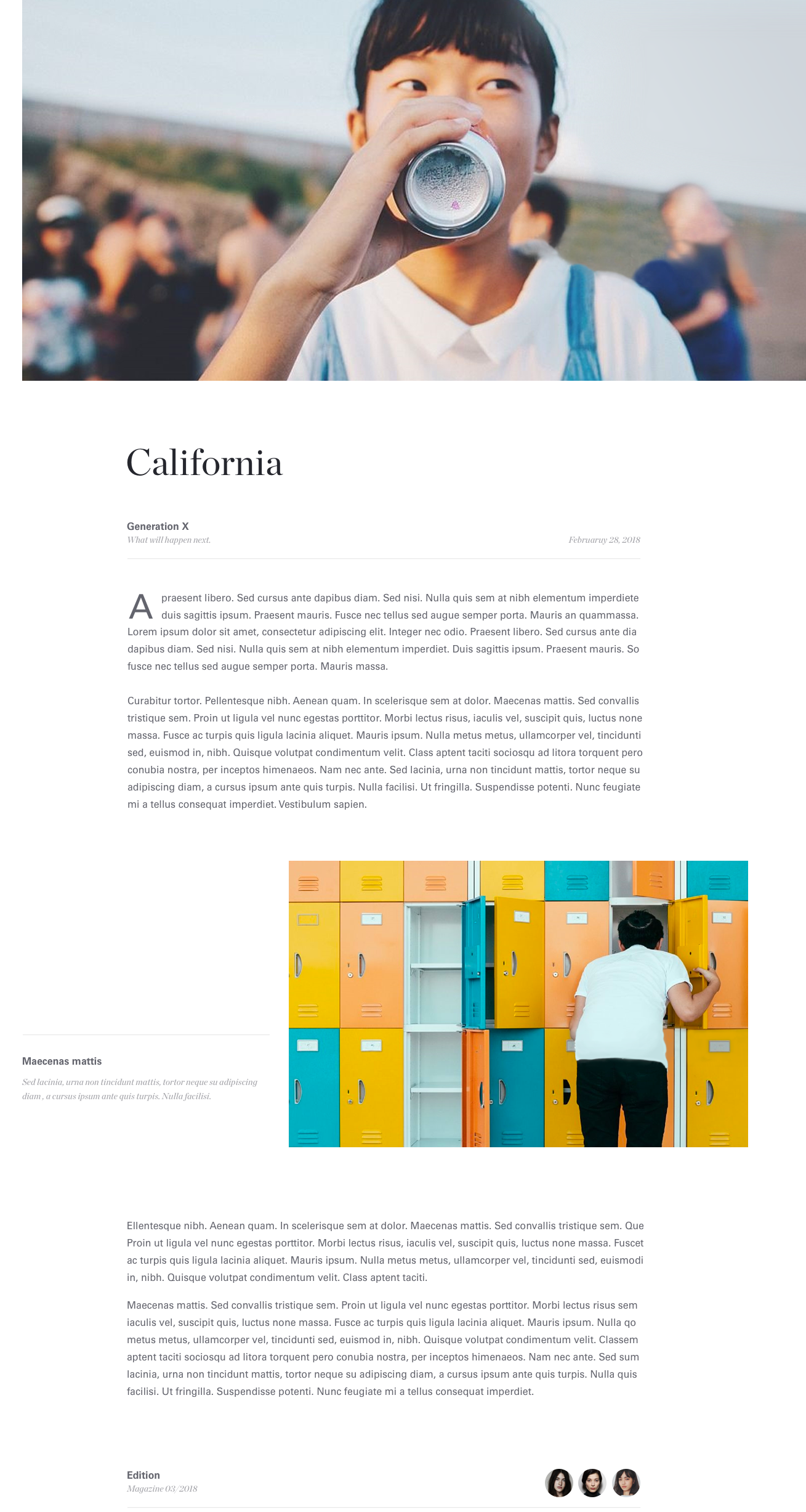
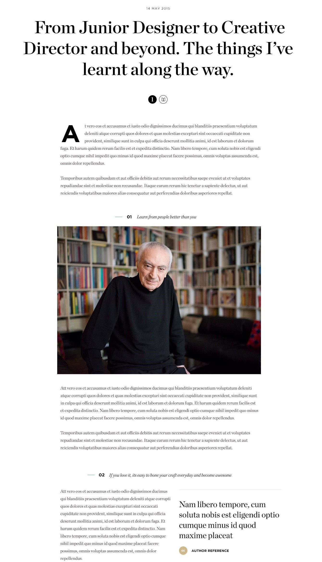
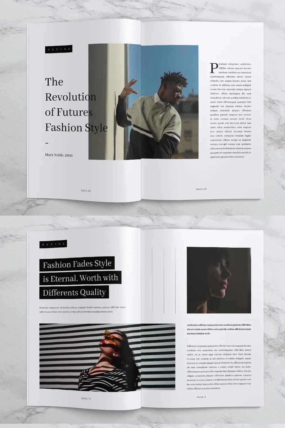
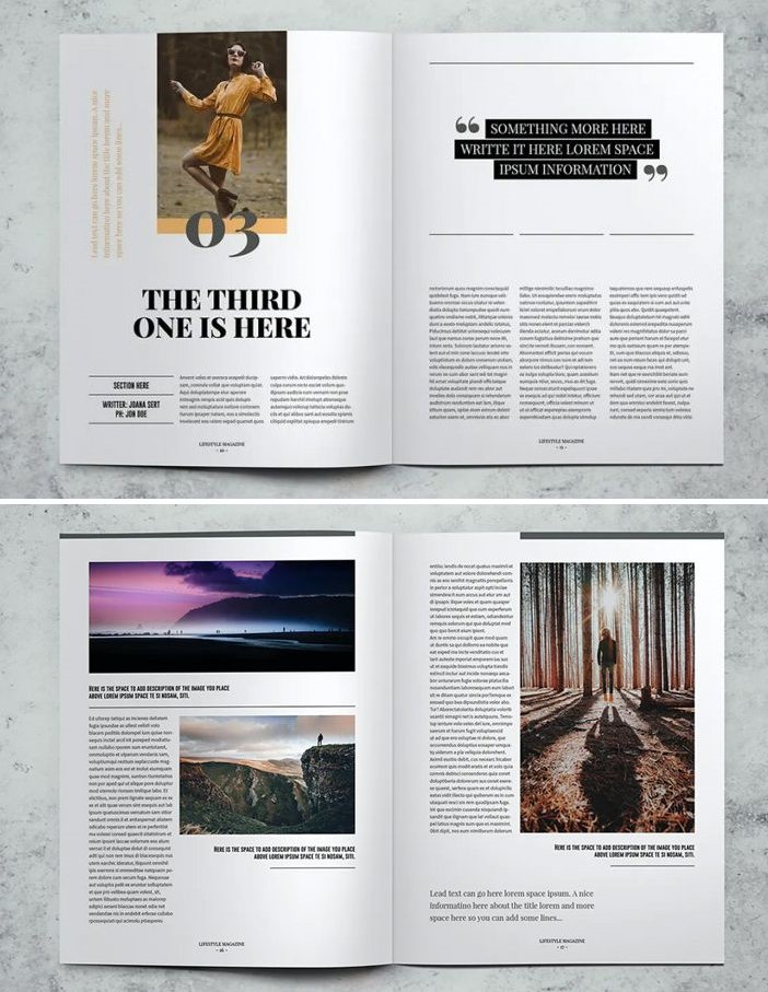
In recent years, in the world of typography and layout, some aspects have become radicalized to the point of leading us to believe that they will most likely also be present in the mise en page that we will see in magazines starting from 2021. Although typographical styles have multiplied and there are numerous contaminations between different media in the last two decades, especially thanks to the advent of new media and the World Wide Web, some specific addresses can be outlined as regards the minimal typographic style and that of design. First, the alternation of massive titles in serif fonts with a body of the text in small dimensions with sans serif or delicate serif fonts. Secondly, the images are often large in size, but are accompanied by modest captions. Third, the margins are often wide but the line spacing is narrow. Finally, the new keywords for the typographic style of the last few years are: elegance, sober colors and clarity. This is not an orderly and geometrically defined layout as for the modernist typography of the fifties and sixties, because today a super minimal layout stands out accompanied by organic and natural shapes and a strong impulse towards humanity, with hand-drawn illustrations, icons and fonts, along with texture ad grain effect: A functional design that seeks unique characteristics, provided by the means of the new media, such as micro-interactions & micro-animations, which fit into what is defined as neumorphism or neomorphism, as the elevation of skeumorphism, where design elements are presented as they appear in real life, which may be mixed with flex design, with familiar and clean interfaces, using highlights and shadows to convey realism.
Font and measures
Font and Typefaces
The font families chosen for this typographic theme are two opposite but complementary typefaces: sans serif for the body of the text and delicate serif for the titles and blockquotes: the combination of serif and sans-serif fonts helps distinguish information hierarchy for the users and combine elegance and clarity:
- A delicate serif (i.e. Playfair Display) was chosen for its perfectly functional design and unique characteristics: elegant, classic and unseating the simple, bold sans-serifs that have reigned supreme for the last few years. They have character but maintain a note of conservatism, they know how to attract attention without using the caps lock or a high font weight;
- A sans serif (i.e. Open Sans) for the body of the text because it guarantees greater legibility, which is fundamental for the near future in which we will be more and more on the screen. From the modernism of the 50s and 60s, to the rebirth of Helvetica at the end of the 90s, on sans serifs we can say with certainty that they will never die.
Measures
In the minimalist style, the body of the text has a much smaller size than that of the titles and notebooks. For this reason, the font size for the body of the text is always less or equal than 1em (for paragraphs and figure captions), while the size of the titles reaches up to double the size: the titles must be eye-catching but never excessive (e.g. the title of the cover page is not excessively larger than the title of an article).
The text is compact, with less than average line spacing (1.5) but there is ample negative space around the text: the margins are exaggeratedly wide compared to the size of the body of the text.
Layout
General assumptions
Since it is a non-existent typographic theme, the sources for the realization of this style are contemporary design magazines with a minimalistic style, but I was also freely inspired by other trends in the field of graphics and design in general, not just printing, for trying to understand in what direction typography is going as a discipline inserted in that complex and organic world full of interactions that is art. In fact, in recent years, more and more attention has been given to the layout, the aesthetic aspect of the text, its form as well as its content. This is not a return to experimentalism or brutalism, but to an elegant and refined minimalism with artistic contaminations. For these reasons, the reference sources for the layout and the measures were: Vogue, Bazaar, Hajinsky Magazine; and artists or designers such as: Sam Sheridan, Rik Oostenbroek, NotooSTUDIO, VJ-TYPE studio and many others.
Print VS Screen
To define a paradigm from which a derivation can be imagined for both digital and print, a more paper-based layout was preferred in the layout of the article; while for the cover page the layout is much more digitally inspired, with similarities to the types of digital publications that are not properly magazines (e.g. personal blogs, home pages or reports from graphic design agencies and so on). In fact, while in the layout of the article the privileged subject is the text itself, on the cover page various graphic elements have been included, exemplary of many trends widespread today. Focusing the layout on the text means it is arranged in a single central column, which allows to give greater evidence to the text and an optimal reading, even when it is interrupted by images or quotations.
Ornaments and other aesthetic features
Among the major trends in the graphic field most used in this historical period, some of them have been chosen in this style for their relevance to the thematic thread (minimalism) and because they are in harmony with each other, as they belong to the same stylistic current in typographic scope. We’re talking about:
- Thin but well defined lines either as ornaments (e.g. in the paragraph with the name of the author of the article) or as delimiters between autonomous text blocks (i.e. blockquotes and figure captions);
- Light if not imperceptible text and box shadows (e.g. in figure captions and with mouse on hover on metadata) to enrich some paratextual elements in a not-excessive way so as not to distract attention from the text;
- Colored backgrounds but always in a delicate way for some paragraphs of greater importance than others (e.g. the one with the publication date of the article);
- Graphic elements that belong to the natural world or with organic/natural shapes; and recall handmade products and hand-drawn illustrations and designs: from line drawings on the cover page to the paint stroke in the background of the main title of the article;
- Small icons at the bottom of the text and next to the name of the author of the article certainly refer to today's digital world, but they also recall the micro symbols and images present in print magazines too.
Another remarkable characteristic, more and more widespread among the minimal but elegant styles, is the attention to details, which do not have a great immediate impact, but positively affect the observant or expert user, for instance the style (applied with the css pseudo-element :selection) to the part of a document that has been highlighted by the user.
Colors: cold and sober powder pigments
For this typographical theme have been chosen some colors derived from neutral dusty powdery pigments, perhaps even nudging toward the masculine end of the color spectrum. They are sober, deep and cold, with:
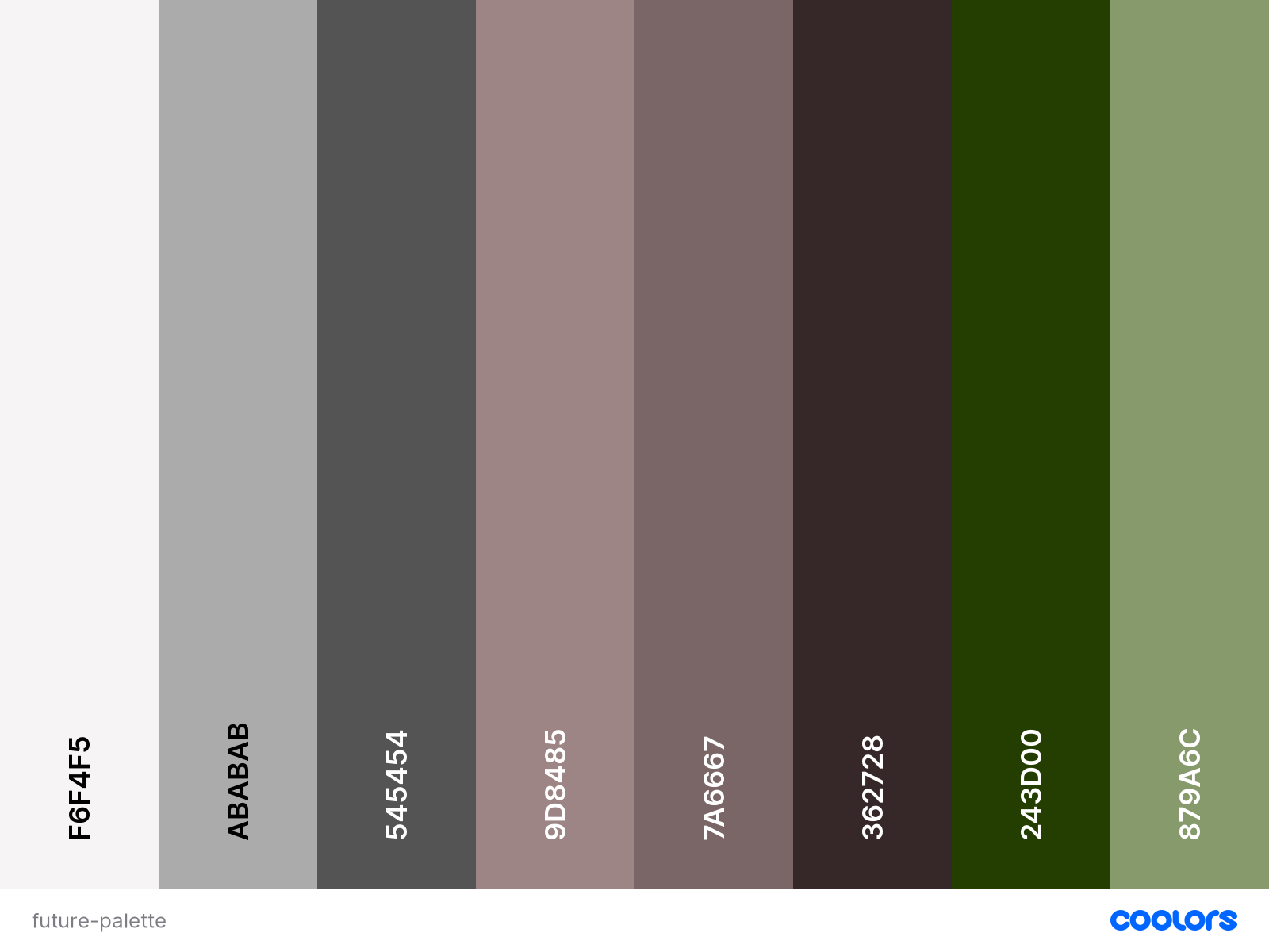
- Constant hue: there are three main colors: deep taupe, army green and black coffee, the others are just different shades – adding black to a pure hue – or tones – adding gray to a pure hue – of the main ones;
- and constant medium and low chroma (low “purity” of the colors).
